鳕鱼天空

This is Mr Wang's Tech Blog.

小程序slider多滑块

尊重劳动成果,转载请注明出处(https://blog.csdn.net/sllailcp/article/details/82595358)...

最近在用原生的代码开发小程序,需要用到多滑块的slider,但是官方的api只支持单滑块,所以就在原来的基础上草草的写了一个。有什么不足的地方还请大家多多指教,想封装成组件的也可自行封装,我这就不讲了。;

话不多说,上代码:

html:

<view class='sliderHCon'>
  <view class='showMoney'>
    <text class='MoneyValue'>¥{{leftShowValue}}</text>
    <text class='MoneyValue'>¥{{rightShowValue}}</text>
  </view>
 
  <view class='twoSlider'>
    <slider class='slider-left' min='{{Min}}' max='{{Max}}' value='{{leftValue}}' activeColor='#ccc' backgroundColor='#ccc' block-size='{{blockSize}}' step='{{step}}' bindchanging="leftChange" rightChange='leftChange'>
      <em class='slider-bg' style='left:{{setSliderLeftX}};width:{{setSliderWidthX}}'></em>
    </slider>
    <slider class='slider-right' min='{{Min}}' max='{{Max}}' value='{{rightValue}}' activeColor='#ccc' backgroundColor='#ccc' block-size='{{blockSize}}' step='{{step}}' bindchanging="rightChange" bindchange='rightChange'/>
  </view>
</view>
css
.sliderHCon {
  height: 250rpx;
  width: 100%;
  margin: auto;
  display: flex;
  justify-content: center;
  align-items: center;
  flex-direction: column;
}
 
.MoneyValue {
  font-size: 30rpx;
  text-align: center;
  color: #999;
  margin-top: 15rpx;
}
 
.showMoney text {
  margin-right: 30rpx;
}
 
.twoSlider {
  width: 100%;
  height:100px;
  display: flex;
  flex-direction: row;
  justify-content: center;
  align-items: center;
  position: relative;
}
.slider-left,.slider-right{position: absolute;left:0;right:0;}
.slider-bg{position: absolute;top:50%;margin-top:-1px;left:0;width:100%;height:2px;background: blue;z-index: 9;}

js:

data: {
      blockSize:20,
      step:10,
      Min: 0, //最小值
      Max: 1000, //最大值
      leftValue: 0, //左边滑块默认值
      rightValue: 1000, //右边滑块默认值
      leftShowValue: 0, //界面显示左边滑块默认值
      rightShowValue: 1000, //界面显示右边滑块默认值
      leftWidth: '50', //左边滑块可滑动长度:百分比
      rightWidth: '50', //右边滑块可滑动长度:百分比
      sliderWidth:0, // slider的宽度;
      setSliderLeftX: 0, // 设置的sliderdiv的left
      setSliderWidthX: 0// 设置的sliderdiv的width
    },
 
onLoad(options) {
      var query = wx.createSelectorQuery(); // 如果是封装的组件的话,这边请注意写法不同哦;
      query.select('.slider-left').boundingClientRect((rect) => {        
        this.setData({
          sliderWidth: rect.width,
          setSliderLeftX: (rect.width / this.data.Max * this.data.leftValue) + this.data.blockSize/2 + 'px',
          setSliderWidthX: rect.width / this.data.Max * (this.data.rightValue - this.data.leftValue) - this.data.blockSize + 'px',
        })
        
      }).exec();
        
    },
 
 // 左边滑块滑动的值
  leftChange(e){
    
    var that = this;
    that.setData({
      leftValue: e.detail.value //设置左边当前值
    })
    this.setSliderBgColor(e,'left');
  },
  // 右边滑块滑动的值
  rightChange: function (e) {
    var that = this;
    that.setData({
      rightValue: e.detail.value,
    })
    this.setSliderBgColor(e, 'right');
  },
 
  setSliderBgColor(e, type){
      if (type == 'left') { // 左边
        if (this.data.leftValue < this.data.rightValue) {
          console.log('拖左不超右边');
          this.setData({ 
            leftShowValue: e.detail.value,
          })
          this.setData({ 
            rightShowValue: this.data.rightValue,
          })
        } else {
          console.log('拖左超右边');
          this.setData({ 
            leftShowValue: this.data.rightValue,
          })
          this.setData({ 
            rightShowValue: e.detail.value,
          })
        }
      } else { // 右边
        if (this.data.leftValue < this.data.rightValue) {
          console.log('拖右不超右边');
          this.setData({ 
            rightShowValue: e.detail.value,
          })
          this.setData({
            leftShowValue: this.data.leftValue,
          })
        } else {
          console.log('拖右超右边')
          this.setData({ 
            leftShowValue: e.detail.value,
          })
          this.setData({ 
            rightShowValue: this.data.leftValue,
          })
        }
      }
 
 
     const v = this.data.sliderWidth / this.data.Max 
      
      if (v * (this.data.rightShowValue - this.data.leftShowValue) - this.data.blockSize >= 0) {
        this.setData({
          setSliderLeftX: (v * this.data.leftShowValue) + this.data.blockSize / 2 + 'px',
          setSliderWidthX: v * (this.data.rightShowValue - this.data.leftShowValue) - this.data.blockSize + 'px',
        })
       // console.log(1)
      } else {
        this.setData({
          setSliderLeftX: (v * this.data.leftShowValue) + this.data.blockSize / 2 + 'px',
          setSliderWidthX: 0 + 'px',
        })
     
      }
    
   
  }

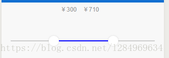
效果图如下(支持点击,拖动),觉得不错的,请给博主一个赞哦。:

--------------------- 本文来自 darkblueLove 的CSDN 博客 ,全文地址请点击:https://blog.csdn.net/sllailcp/article/details/82595358?utm_source=copy

微信小程序— slider(滑动选择器)

今天来介绍一下slider(滑动选择器):

官方文档:https://mp.weixin.qq.com/debug/wxadoc/dev/component/slider.html

1.效果图如下,

2.index.js中:

//index.js
//获取应用实例
const app = getApp()
var that;
var isDisabled = true;
Page({
  data: {
    //默认最小值20;
    min: 20,
    //默认最大值20;
    max: 100,
    //设置不禁用
    disabled: false,
    //设置选中默认颜色
    colorSelect: '#00ff00',
    //设置背景颜色
    backgroundColor: "#ccc",
    //设置滑块的大小
    blockSize: 28,
    //设置滑块的颜色
    blockColor: "#eeeeee",
    //是否显示当前 value
    showValue: true,
    //步长
    step: 5,
  },

  onLoad: function () {
    that = this;
  },
  //设置最小值
  minInput: function (e) {
    that.setData({
      min: e.detail.value,
    })
  },
  //设置最大值
  maxInput: function (e) {
    that.setData({
      max: e.detail.value,
    })
  },
  //设置是否禁用滑动
  btnDisabled: function (e) {
    if (isDisabled == true) {
      isDisabled = false;
      that.setData({
        disabled: true,
      })
    } else {
      isDisabled = true;
      that.setData({
        disabled: false,
      })
    }
  },
  //已选择的颜色
  colorSelectInput: function (e) {
    that.setData({
      colorSelect: e.detail.value,
    })
  },
  //设置背景条的颜色
  bgColorInput: function (e) {
    that.setData({
      backgroundColor: e.detail.value,
    })
  },
  //设置滑块的大小
  blockSizeInput: function (e) {
    that.setData({
      blockSize: e.detail.value,
    })
  },
  //设置步长,取值必须大于 0,并且可被(max - min)整除
  stepInput: function (e) {
    that.setData({
      step: e.detail.value,
    })
  },
  //设置滑块的颜色
  blockColorInput: function (e) {
    that.setData({
      blockColor: e.detail.value,
    })
  },
  //设置是否显示当前value
  btnshowValue: function () {
    that.setData({
      showValue: false,
    })
  },
  //完成一次拖动后触发的事件
  sliderchange: function (e) {
    wx.showToast({
      title: "拖动后触发" + e.detail.value,
      duration: 1000
    })
  },
  //拖动过程中的触发的事件
  bindchanging: function (e) {
    wx.showToast({
      title: "拖动中触发" + e.detail.value,
      duration: 1000
    })
  },
})

3.index.wxss中:

/*输入框样式  */

.section {
  width: 93%;
  margin: 20rpx;
  background-color: #ccc;
  padding: 10rpx;
  font-size: 30rpx;
  border-radius: 5px;
}

/*button样式  */

.button {
  width: 95%;
  margin: 20rpx;
}

4.index.wxml中:

<view class="section_gap">
  <text class="section__title">使用示例:</text>
  <view class="body-view">
    <slider bindchange="sliderchange" bindchanging="bindchanging" min="{{min}}" max="{{max}}" disabled="{{disabled}}" activeColor='{{colorSelect}}' backgroundColor='{{backgroundColor}}' block-size='{{blockSize}}' block-color='{{blockColor}}' step="{{step}}" show-value='{{showValue}}'/>
  </view>
</view>

<view class="section">
  <input placeholder="设置最小值,默认为20" type="number" bindinput="minInput" confirm-type="done" focus/>
</view>

<view class="section">
  <input placeholder="设置最大值,默认为100" type="number" bindinput="maxInput" confirm-type="done" focus/>
</view>

<view>
  <view class='text'>设置已选择的颜色(请使用十六进制颜色值,例如:#ff00ff)</view>
  <input class="section" placeholder="" value="#" bindinput="colorSelectInput" confirm-type="done" focus/>
</view>

<view>
  <view class='text'>设置背景条的颜色(请使用十六进制颜色值,例如:#ff00ff)</view>
  <input class="section" placeholder="" value="#" bindinput="bgColorInput" confirm-type="done" focus/>
</view>

<view>
  <view class='text'>设置滑块的颜色(请使用十六进制颜色值,例如:#ff00ff)</view>
  <input class="section" placeholder="" value="#" bindinput="blockColorInput" confirm-type="done" focus/>
</view>

<view class="section">
  <input placeholder="设置滑块的大小,取值范围为12 - 28" type="number" bindinput="blockSizeInput" confirm-type="done" focus/>
</view>

<view class="section">
  <input placeholder="步长,取值必须大于 0,并且可被(max - min)整除" type="number" bindinput="stepInput" confirm-type="done" focus/>
</view>

<button class='button' catchtap='btnDisabled'>设置/取消禁用</button>
<button class='button' catchtap='btnshowValue'>隐藏当前value</button>
  •  

--------------------- 本文来自 Afanbaby 的CSDN 博客 ,全文地址请点击:https://blog.csdn.net/afanbaby/article/details/79206852?utm_source=copy